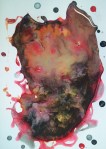
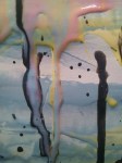
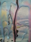
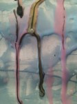
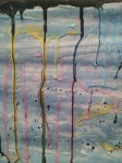
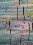
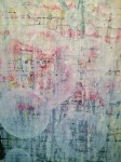
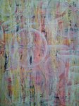
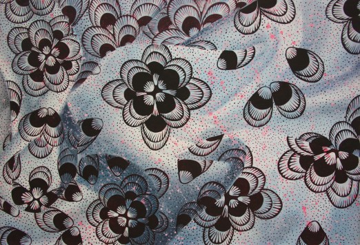
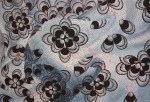
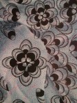
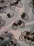
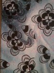
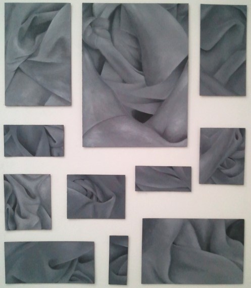
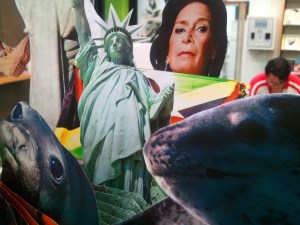
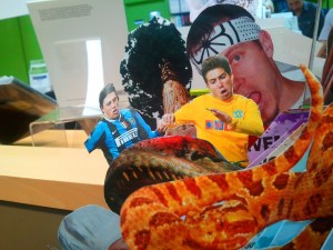
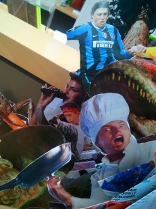
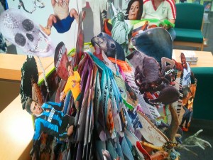
I finished my piece keeping in mind the idea of a triptych; having done some research on Francis Bacon I noted the spiritual importance of a triptych and how first examples are found in churches. I’m still on the journey of discovering my own interpretation of faith, but to kick-start my research I’m hoping to engage with the public, asking questions of their beliefs in the supernatural. So far I’ve had a brief encounter with Mormons; it’ll be interesting to find out just what they believe in. I’m not sure whether it’s just another branch from modern-day Christianity.
Category: Miscellaneous
Eureka 2
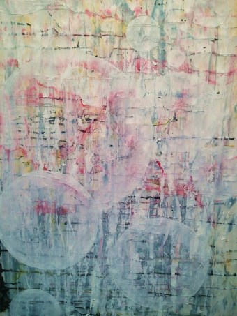
So a few posts ago I did the whole experiment with the PVA glue and paint. I decided to give it a go and actually paint what I see and for a first attempt I’m quite happy with the result, and the fact that I finished in less than 5 hours is freaking me out. May be finally on to a winner; now it’s just the case of tweaking my FMP proposal :D. Ah art how you choose to evolve. Painted this at home, couldn’t be bothered to paint in uni as I had all the materials at home and now that I’ve FINALLY got my easel and camera; NOTHING CAN STOP ME!!! So expect a lot more this 2 months.
BUBBLES
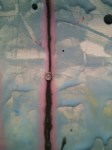
I had a day of painting whatever entered my mind at any particular moment. I was also challenged by my tutor to paint on a large-scale as I always limit myself to A0. So I painted on a scale of 210cm x 170cm. The ribbon was probably my subconscious wanting to paint fabric however yet again THE BUBBLES ARE BACK. This time they have managed to produce a sense of space in my painting that I’ve never experienced before. And my work rate is beginning to scare me, this painting only took a day to finish.
Eureka
Art has its moments of grief, but when you have that EUREKA moment you just want to mass produce again. I’ve finally got the final basis of my project; it all started whilst making more PVA and paint experiments, I stretched some paper and began construction my paintings when I noticed the paint & PVA mix dripping on the floor mixing and merging into something new, I loved the outcome so purposely spilled some on a piece of paper and slowly something amazing formed. From this experiment I would like to continuously do this and hopefully aim to paint some of the outcomes on a large-scale.
Bubbles
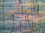
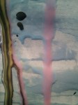
Well I started my Final Major Project. With my new thought process of producing work not for the sake of it; I started playing around with paint and PVA glue the final outcomes where interesting and I’m interested to see were my mind will lead me next. I took close-ups of the painting and noticed bubbles forming from the dripping paint and PVA, and I was hooked, now the bubbles appear to be all over my work.
A1 Paper
Chitenge
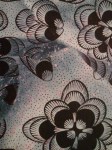
Well I thought I would have a go at producing something completely different from the frame of work I was doing last year. I took inspiration from my trip to Amsterdam. Looking at Rembrandt’s painting of printed fabric, I wondered how he was able to achieve such an effect. I noted that he must have painted in layers. Chitenge material is an african material that showcases an array of prints and colours. I painted the fabric in three stages. I don’t try to have the subject of identity in my work but it always shows, so fighting it won’t help, I simply embrace it.
Jacket
This was my final piece for our foundation exhibition in the Herbert Read Gallery. It wraps up my final thought for my 2011 art work; and my old way of thinking in general. I hope to produce more work, not for the sake of producing work , but actually having my work reflect my thoughts and emotions. So my work will be extremely random. Our theme for this exhibition was ‘Books.’ Our thought process was to not think of a conventional book but what a book represents; my representation was not based on a story but the repetition found in books. The constant flicking of the page as well as the information you gain. I also find that some information on certain pages carry more importance for the book as a whole than other pages. The final piece showcases studies of my jacket painted on cardboard.
Amsterdam Cont.
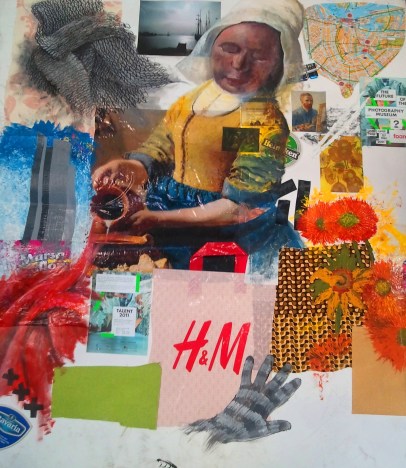
Following my trip to Amsterdam we were given a brief to create a mind map to best express, or at least summarise my trip to Amsterdam using various mediums and techniques. My end outcome was this….
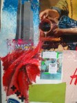
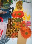
I tried to ‘Summarise’ my experience on my 1m x 1m mood board. The red fabric on the bottom left represents my experience of the red light district, I found it funny how such a tiny portion of Amsterdam was highly amplified by everyone here in the UK when in actual fact it was pathetically short and uninteresting. My experience was all about the cultural side of Amsterdam, most importantly the Rijks Museum and the Van Gogh; which I must say is a DEFINITE MUST GO when your over there. To represent this I made the most influential image Vermeer’s ‘The Milk Made’ take centre stage of my mood board as I really loved the Dutch Master’s work. But even more amazing was seeing a Van Gogh so close up, represented by the sun flowers painted on the right. The cropped map on the top right shows the path we took on the bike ride (7 HOURS!!!!!) but still it was amazing. We did visit the sculpture museum which wasn’t impressive for its sculpture garden (well for me anyway) but more so the Kroller Muller gallery (AMAZING) which showcases an impressive collection of art many of which I recognised as there are artists I always referred to in GCSE art. I also got the sence of consumerism as the branded shops we have here in the were everywhere in Amsterdam which corrupted my tourist view of Amsterdam, however i did get a bargain in H&M for two pairs of gloves. Below are some close up images of the mood board 😀
UCA carousel: Fashion and Textiles
To be honest I did have my preconception of fashion and textiles; I didn’t like what most fashion stood for (expensive clothing that makes you look stupid) and wasn’t looking forward to this project. However once I got into it I found myself enjoying the subject; our brief was to create a fashion or textile outcome from a character or muse of our choice using old shoes and bags. I originally started by picking Will.I.Am as my muse creating a leather jacket, as most of my items where leather-based. I started making mini jackets due to the time, pinning bits of bag and shoe to make mini compositions.
It was from this exercise that I was able to figure out my final composition for my jacket which seemed to have a female silhouette due to the shape of the mannequin but the outcome wasn’t all that bad. My friend Sophia had done this project before me and has a better understanding of fashion than me; it was her who infromed me to work on the contour of the mannequin as the designs tend to reveal themselves after some manipulation. As I worked in miniature i had finished my first jacket; which then led me to further carry on producing two more jackets. Overall my precoception of fashion has completely as i never realised how much textiles influences my work, because of this i will always keep in mind a textiles outcome to some of my work. Below are the three jackets I produced for this project.
All compositions together
UCA carousel: 3D Design
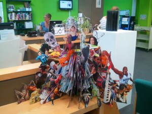
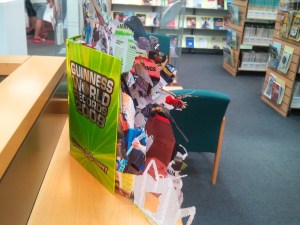
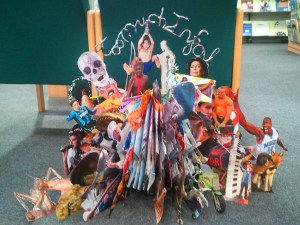
I’ve learnt a lot from 3D design of what type of artist I am. I know that I like the idea of making something out of nothing so the idea of making something 3D was great. For this week I had to Make a 3D piece of work from a book that had influenced me in any way. I chose the Guiness World Records 2009 as my starting point as i love pointless information; it contains facts that you don’t really need to know but could find interesting. As a child i would look through the whole book sometimes reading all the recordsm page by page, yet at the end i would forget 95% of the records set only remembering the most unusual and factoral records that interested me the most.
for my final piece i came up with the conclusion that the book just contained TOO MUCH INFORMATION… so my piece would reflect this.
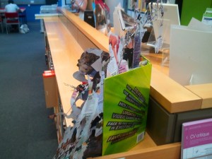
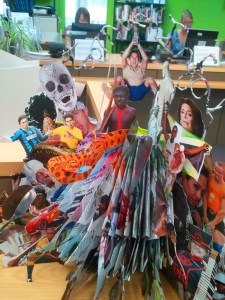
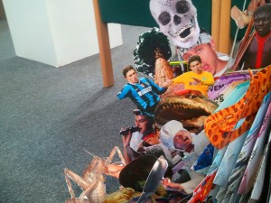
This was my final piece for this project; the title being “Too Much Info” reflecting my observation of the book. My main inspiration was Su Blakwell who inspired me to include pieces such as the typography in the piece and the use of the 2D cut outs to make my final composition. The Pictures Below are of different views of the book 😀
UCA carousel: Visual Communication
First off I had NO IDEA THIS EXISTED… It was a great experience doing a subject of art that i never thought of. Vis Com is SO relevant to the art world of today as it includes illustration, advertising, fashion, graphic design etc.. My Topic was making a cup of tea; it didn’t have to be the literal meaning of physically making tea; it could have been expanded to where tea was first discovered where it’s grown etc. I chose to go with the where it’s grown route. I did my research recording my work as I went on; however it is only during my conversation with a tutor which changed my view completely about tea production. He told me of the hidden hardships of the tea making business and how workers would get virtually nothing according to western analysis; which is typical of raw material manufacture, where the true profit comes from the process of advertising and selling tea.
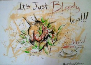
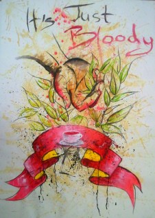
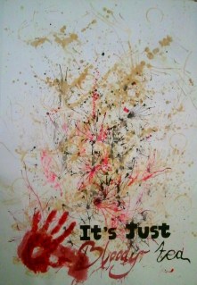
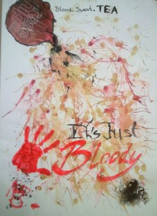
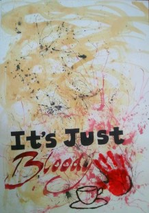
Tea leaves are naturally sharp and tiny as it’s the new shoots that are picked to make tea. Workers, after hours of picking, are left with cut, bloody hands, something I never thought would be an outcome of tea picking. It’s because of this why I wanted my final work to have this message of brutality, all in the pursue of cheap tea. My final piece was a series of posters with the slogan IT’S JUST BLOODY TEA as my way of communicating my message. I wanted to explore the different ways i could portray this, and if i had more days (as we only had a week 😡 ) i would have produced more poster ideas applying the use of negative space as most of my compositions are quite busy; however the message is carried across as it shows the chaotic nature of tea production.
This was my initial idea having a visual hand in the poster, however i felt that this idea was to basic and GCSE… so i carried on exploring how i could compose the poster in a more commercial way while still haveing the message portrayed clearly.
I really enjoyed Vis Com and would have loved to explore more ways of manipulating this project, i tried adding tea to the actual poster and some compositions worked well.


