Past Alevel experience :D

I’m not going to lie I HATED!!! Alevel with a passion; I felt that it was 2 years of my life I will never get back. Yet it’s thanks to A level that I’m in this position right now 😀 anyway I FINALLY have all my art work from the years and was amazed at the systematic way in which I work. It seems like I go in and out of themes. The following work is from my A level exam.

The Final Outcome (8hours O_O”)

When Boredom Strikes

Like I said in an earlier post I became a bit lazy mid-way in the pathway and felt very unmotivated. My solution is always to start doing something random; so I got my images from Amsterdam and began painting in a style I’m not used to the outcome was this…

I worked once again with acrylic paint but watered it down to get this loose effect. I remembered that most of the paintings in the Rijks Museum, of fabric, where often made up of marks of paint which if view together created the final article. From this painting, I took a glimpse of my photos and noticed a postcard I’ve always had but never paid attention to. It showcases the painting by Philippe de Champaigne entitled ‘Cardinal Richelieu’

For the first time I noticed the dramatic nature in which the fabric is painted and got more and more interested the more my eyes worked round the postcard. I was so inspired that i began to make numerous studies of all shapes and sizes, I even went as far as knitting rope and painting and painting on the knitted fabric to see what effect I would get from it. Below is a slide show of my moment of crazed obsession.

Amsterdam Cont.

Following my trip to Amsterdam we were given a brief to create a mind map to best express, or at least summarise my trip to Amsterdam using various mediums and techniques. My end outcome was this….

I tried to ‘Summarise’ my experience on my 1m x 1m mood board. The red fabric on the bottom left represents my experience of the red light district, I found it funny how such a tiny portion of Amsterdam was highly amplified by everyone here in the UK when in actual fact it was pathetically short and uninteresting. My experience was all about the cultural side of Amsterdam, most importantly the Rijks Museum and the Van Gogh; which I must say is a DEFINITE MUST GO when your over there.  To represent this I made the most influential image Vermeer’s ‘The Milk Made’ take centre stage of my mood board as I really loved the Dutch Master’s work. But even more amazing was seeing a Van Gogh so close up, represented by the sun flowers painted on the right. The cropped map on the top right shows the path we took on the bike ride (7 HOURS!!!!!) but still it was amazing. We did visit the sculpture museum which wasn’t impressive for its sculpture garden (well for me anyway) but more so the Kroller Muller gallery (AMAZING) which showcases an impressive collection of art many of which I recognised as there are artists I always referred to in GCSE art. I also got the sence of consumerism as the branded shops we have here in the were everywhere in Amsterdam which corrupted my tourist view of Amsterdam, however i did get a bargain in H&M for two pairs of gloves. Below are some close up images of the mood board 😀

Amsterdam :D

My trip to Amsterdam was AMAZING the whole atmosphere was incredible and I don’t mean that due to the weed fumes. The galleries were great the 7 hour bike ride was surprisingly refreshing and i have been inspired by the Dutch painters. Amsterdam is not something that could be explained in words so below is a slide show of the images i took of the side of Amsterdam I saw.

Fine Art :D

It’s been a while since I uploaded my last thoughts; well to update you all on my progress I CHOSE FINE ART!! Like you didn’t see that coming 😛 Anyway, I have enjoyed myself in the fine art pathway, progress was a bit slow to begin with; then I started working which slowed me down even more -_- but now it’s the holidays and I’m starting to get used to my new schedule, GROWING UP SUCKS!!

Our project to kick-start the pathway was Deconstruction Reconstruction and looking at my work previously I noted that I was very keen on portraiture. however I didn’t want to, straight away, paint figures. I wanted to explore different ways of portraying a portrait; I decided to look at myself to begin with, not because of vanity but as a starter to make me think of ways of representing ME. I thought I was going to take an abstract way of looking at things but a discussion with a lecturer made me realise that my art was more of a representation of something rather than an abstract view. With this correction my work took on a whole new twist; looking at Alison Watt’s ‘Phantom’ oil paint series I began to look at fabric again. Alison Watt’s work is described to be many things, but I like to interpret it as portraiture, there’s no doubt that her fabric paintings have a human presence, due to the nature of the distorted fabric shapes within the painting. I then began to look at Christian Boltanski’s work who, in a way, works similarly to Alison Watt. He makes installations, often of objects that have had a past or photographs; displayed in such a way to provoke an emotional (often empathetic) response to the veiwer.
I want my work to reflect both these responses with the use of other references I may get from artists later on; however for now I simply looked at the element of fabric, the following pictures below are the experiments I started with to kick-start this project.

WP_001022

UCA Carousel: Lens Based Media

This being the final project I did feel a bit lazy and my usual work ethic was lacking however it was during the later stages of the project that  began developing my ideas. Looking at one of the new artists whom I found interesting I wanted to create an installation based on early memories of me from a young age to the stage in at now. The project brief was I am Here, and I thought that having various images of my development would show the gradual progression of my life’s journey to where I am now. The earlier pictures of me were to be distorted and blury as these were memories that i wasn’t so sure of, yet as you progressed further to my later life the images would get clearer and cleaner until you reach the point were you just have a clear representation of ME as I am today. Sadly I didn’t have enough time to do so, yet it’s an idea I hope carry on this idea to my Fine Art project as that’s the pathway i would most likely enjoy. the images below however are images I took during the pathway exploring different photographic concepts.

Nicki Minaj Painting :D

Following a discussion with a friend I’ve always wanted to have Nicki Minaj as a muse for some of my paintings. To start off I decided to do a portrait of her which was difficult as she has various sides to her character; however I decided to paint her in a neutral way with no crazy expressions as that’s how I see her. Through all her crazy characters she can actually come across as normal.

AND This is the final result 😀

UCA carousel: Fashion and Textiles

To be honest I did have my preconception of fashion and textiles; I didn’t like what most fashion stood for (expensive clothing that makes you look stupid) and wasn’t looking forward to this project. However once I got into it I found myself enjoying the subject; our brief was to create a fashion or textile outcome from a character or muse of our choice using old shoes and bags. I originally started by picking Will.I.Am as my muse creating a leather jacket, as most of my items where leather-based. I started making mini jackets due to the time, pinning bits of bag and shoe to make mini compositions.

It was from this exercise that I was able to figure out my final composition for my jacket which seemed to have a female silhouette due to the shape of the mannequin but the outcome wasn’t all that bad. My friend Sophia had done this project before me and has a better understanding of fashion than me; it was her who infromed me to work on the contour of the mannequin as the designs tend to reveal themselves after some manipulation. As I worked in miniature i had finished my first jacket; which then led me to further carry on producing two more jackets. Overall my precoception of fashion has completely as i never realised how much textiles influences my work, because of this i will always keep in mind a textiles outcome to some of my work. Below are the three jackets I produced for this project.

All compositions together

UCA carousel: 3D Design

I’ve learnt a lot from 3D design of what type of artist I am. I know that I like the idea of making something out of nothing so the idea of making something 3D was great. For this week I had to Make a 3D piece of work from a book that had influenced me in any way. I chose the Guiness World Records 2009 as  my starting point as i love pointless information; it contains facts that you don’t really need to know but could find interesting. As a child i would look through the whole book sometimes reading all the recordsm page by page, yet at the end i would forget 95% of the records set only remembering the most unusual and factoral records that interested me the most.

for my final piece i came up with the conclusion that the book just contained TOO MUCH INFORMATION… so my piece would reflect this.

This was my final piece for this project; the title being “Too Much Info” reflecting my observation of the book. My main inspiration was Su Blakwell who inspired me to include pieces such as the typography in the piece and the use of the 2D cut outs to make my final composition. The Pictures Below are of different views of the book 😀

UCA carousel: Visual Communication

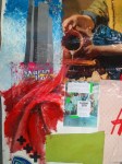
First off I had NO IDEA THIS EXISTED… It was a great experience doing a subject of art that i never thought of. Vis Com is SO relevant to the art world of today as it includes illustration, advertising, fashion, graphic design etc.. My Topic was making a cup of tea; it didn’t have to be the literal meaning of physically making tea; it could have been expanded to where tea was first discovered where it’s grown etc. I chose to go with the where it’s grown route. I did my research recording my work as I went on; however it is only during my conversation with a tutor which changed my view completely about tea production. He told me of the hidden hardships of the tea making business and how workers would get virtually nothing according to western analysis; which is typical of raw material manufacture, where the true profit comes from the process of advertising and selling tea.

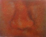
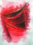
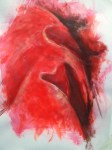
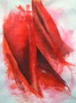
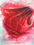
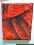
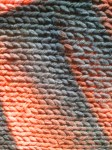
Tea leaves are naturally sharp and tiny as it’s the new shoots that are picked to make tea. Workers, after hours of picking, are left with cut, bloody hands, something I never thought would be an outcome of tea picking. It’s because of this why I wanted my final work to have this message of brutality, all in the pursue of cheap tea. My final piece was a series of posters with the slogan IT’S JUST BLOODY TEA as my way of communicating my message. I wanted to explore the different ways i could portray this, and if i had more days (as we only had a week 😡 ) i would have produced more poster ideas applying the use of negative space as most of my compositions are quite busy; however the message is carried across as it shows the chaotic nature of tea production.

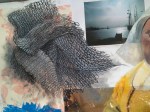
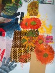
This was my initial idea having a visual hand in the poster, however i felt that this idea was to basic and GCSE… so i carried on exploring how i could compose the poster in a more commercial way while still haveing the message portrayed clearly.

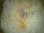
I really enjoyed Vis Com and would have loved to explore more ways of manipulating this project, i tried adding tea to the actual poster and some compositions worked well.

UCA carousel: Fine Art

As part of my univesity course I had to start a blog; just as well i started this one :D…. I first started with fine art continuing my environment project. For each project we had 1 week to complete a task set with a final piece at the end. The topic was “Wonderland,” though we didn’t have to take the Lewis Carroll route, the general idea was to create an environment that was an escape from reality. My play on wonderland was set in Elizabethan times. My twist was to have somenone of ethnic skin dressed up in Elizabethan clothing; not typical of that period as slaves were treated less than even house pets. It was an interesting idea as the whole appeal of wonderland was being in a place not familiar to your up-bringing; something that all immagrants have to do day to day. I never considered how different my life is until i had a good conversation with my mum, who told me about her background and our culture.

Knower days we change ourselves to adapted to our environments yet somehow we still have our very own cultural influences that never leave us; for this reason my final piece was painted on African (Zambian) Chitenge material, to relfect the ever present influence of culture in our lives.

This was how the Final piece was presented, i did initially have the triplet decsending but Ian wanted it this way :/. I added the silhouettes to add some contrast to the composition to help draw the viewers eyes to the piece, it also went well with the wonderland piece as the Lewis Carroll impression of his wonderland is often portrayed in a victorian setting.

Close up of the face

Full Close up of the central image.

Cont.

This was also for my GCSE only this time it was an exam piece. I am a HUGE fan of Keith Mallett work and he was my main source of inspiration for this painting. 😀

#

Below are the studys i made for the painting

 my study of “Uzuri” by Keith Mallett

 random just got bored 😛